National Visualization Analysis
gun_violence_state_df=
read_csv("data/gun violence/mass shootings(all years).csv") %>%
  janitor::clean_names() %>%
  select(-incident_id,-address,-operations) %>%
  separate(incident_date,into=c("day","month","year"),sep="-") %>%
  group_by(state,year) %>%
  mutate(number_year_killed=sum(number_killed),number_year_injured=sum(number_injured),year=as.numeric(year)) %>%
  ungroup() %>%
  filter(year!="17") %>%
  mutate(year=year+2000) %>%
  select(-city_or_county)
gun_violence_state_df=
read_csv("data/gun violence/mass shootings(all years).csv") %>%
janitor::clean_names() %>%
select(-incident_id,-address,-operations) %>%
separate(incident_date,into=c("day","month","year"),sep="-") %>%
group_by(state,year) %>%
mutate(number_year_killed=sum(number_killed),number_year_injured=sum(number_injured),year=as.numeric(year)) %>%
ungroup() %>%
filter(year!="17") %>%
mutate(year=year+2000) %>%
select(-city_or_county)year_month_state_massshooting=
gun_violence_state_df %>%
group_by(year,month,state) %>%
mutate(number_mass_shooting=n()) %>%
group_by(year,month,state,number_mass_shooting) %>%
summarise() %>%
mutate(year_month=str_c(year,month,sep="")) %>%
mutate(month=match(month,month.abb)) %>%
group_by(year) %>%
arrange(month) %>%
filter(year_month!="2021Nov")
year_month_state_massshooting %>%
mutate(year_month=fct_inorder(year_month)) %>%
group_by(year_month) %>%
count() %>%
rename(number_mass_shooting=n) %>%
ggplot(aes(year_month,number_mass_shooting)) + theme_bw(base_size=15 ) +
geom_xspline(aes(group=1),color="lightblue",size=0.7) + geom_point(color="lightblue",size=1.5) +
geom_segment(aes(x = 25, y = 10, xend = 25, yend = 31) ,size=0.5,colour = "red",linetype="dashed") +
geom_text(aes(x=25, y= 30, label = "first case of death in US " ), colour = "red", vjust = -2, hjust = 0.5, size = 3) +
labs(x = "Month Year ", y = "Mass Shooting", title = "National Mass Shooting in US ",caption="(Source:www.gunviolencearchive.org)") + theme( plot.title = element_text(colour = "black", face = "bold",
size = 20, vjust = 3, hjust = 0.5), plot.margin = unit(c(0.2, 0.2, 0.2, 0.2), "inches"),axis.text=element_text(colour="black",size=8),axis.title=element_text(size=10)) + theme(axis.text.x = element_text(angle = 90, vjust = 0.5, hjust =1),plot.caption = element_text(size=7)) 
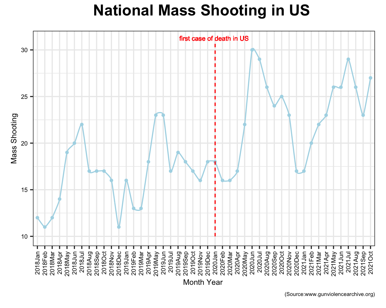
The plot above shows a fluctutation in national mass shooting number in US from January 2018 to October 2021. From the plot, we can reach two conclusions.First, there is a seasonal pattern in national mass shooting that in every year, basically, number of mass shooting will begin to increase from January and reach its peak in summer and then reduce to bottom. Second, 2020 saw a huge increase in mass shootings compared with previous years, and 2021 is trending a little lower. After data processing in R, there is nationally mass shootings jumped nearly 50% during a pandemic with crippling unemployment, violent protests and idle youth.
unemploy_gun <- read_csv("data/unemployment_gun.csv")
UNRATE <- read_csv("data/unemployment rate/UNRATE.csv")
unemploy_gun_IL = unemploy_gun %>%
  filter(state == c("Illinois")) %>%
  mutate(time=fct_inorder(time)) %>%
  arrange(time)

UNRATE %>%
  ggplot(mapping = aes(x = DATE , y = UNRATE, group= 1)) + theme_bw()+
  geom_line(color="red",size=1) +
  ylab("Unemployment Rate")+
  xlab("Time")+
  labs(title = " Unemployment Rate in US from 2018 to 2021",caption="(Source:opendata.cityofnewyork.us/)")+
 theme( plot.title = element_text(colour = "black", face = "bold",
    size = 20, vjust = 3, hjust = 0.5), plot.margin = unit(c(0.2, 0.2, 0.2, 0.2), "inches"),axis.text=element_text(colour="black",size=11),axis.title=element_text(size=15)) + theme(plot.caption = element_text(size=7))
With the increase in shootings, we have paid more attention to shootings and became interested in what factors have affected the sharp increase in shootings. First of all, a set of data from major news newspapers enters our field of vision. Every day we can see reports of unemployment rate in the news. It is very interesting that the unemployment rate has been increasing since the outbreak of the new crown epidemic, which has the same trend as the increase in shootings. Therefore, we mapped the changes in the unemployment rate in the United States two years before and after the outbreak of the new crown. From this picture, we can see that two months after the outbreak of the new crown, the unemployment rate began to increase significantly, which is related to the self-quarantine policy that was just started. Later, society began to adapt to the epidemic, and there was a corresponding decline. However, because the epidemic caused structural damage to the economy, the unemployment rate has remained at a high level ever since.
mass_shooting_state=
  gun_violence_state_df %>%
  group_by(state) %>%
  count() %>%
  select(number_mass_shooting=n) %>%
  arrange(number_mass_shooting) %>%
  mutate(Number=number_mass_shooting)

mass_shooting_state %>%
  ggplot(aes(x=fct_reorder(state,number_mass_shooting),y=number_mass_shooting,fill=Number)) + geom_bar(stat = "identity", colour = "black",position = "dodge") + theme_bw( ) +
  theme(axis.text.x = element_text(angle = 90, vjust = 0.5, hjust =1))+ labs(y= "Mass Shooting", x = "State",title="Top States with highest \n number of Mass Shooting",caption="(Source:www.gunviolencearchive.org)") + theme( plot.title = element_text(colour = "black", face = "bold",
size = 15, vjust = 3, hjust = 0.5), plot.margin = unit(c(0.2, 0.2, 0.2, 0.2), "inches"),axis.text=element_text(colour="black",size=3)) + theme(axis.text.x = element_text(angle = 90, vjust = 0.5, hjust =1,size=8),axis.text.y = element_text(size=8),axis.title=element_text(size=10),plot.caption = element_text(size=7)) 
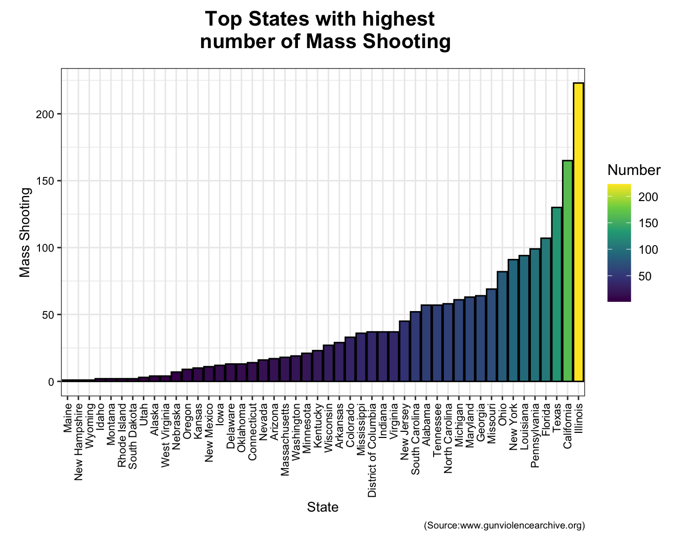
We arrange 48 states in an ascending way according to the number of mass shooting from 2018 to 2021. As shown in the bar chart, top 8 states are Illinois, California, Texas, Florida, Pennsylvania, Louisiana, New York and Ohio respectively. As one of city in Illinois, Chicago Leads the nation in mass shootings, averaging about one per week.
plot_1 = unemploy_gun_IL %>%
  ggplot(mapping = aes(x = time , y = value, group= 1)) +
  geom_line()+theme(axis.text.x = element_text(angle = 90)) +
  ylab("Unemployment Rate")+
  labs(title = " Unemployment Rate vs Number of \n Mass Shooting in Illinois")+
  theme( plot.title = element_text(colour = "black", face = "bold",
  size = 13, vjust = 3, hjust = 0.5))

plot_2 = unemploy_gun_IL %>%
  ggplot(mapping = aes(x = time , y = number_mass_shooting, group= 1)) +
  geom_line()+theme(axis.text.x = element_text(angle = 90)) +
  ylab("Number_mass_shooting")

fig=ggarrange(plot_1, plot_2,ncol = 1, nrow = 2)
fig + theme( plot.title = element_text(colour = "black", face = "bold",
    size = 20, vjust = 3, hjust = 0.5), plot.margin = unit(c(0.2, 0.2, 0.2, 0.2), "inches"),axis.text=element_text(colour="black",size=11),axis.title=element_text(size=15)) + theme(plot.caption = element_text(size=7)) +labs(caption="(Source:www.bls.gov/)")
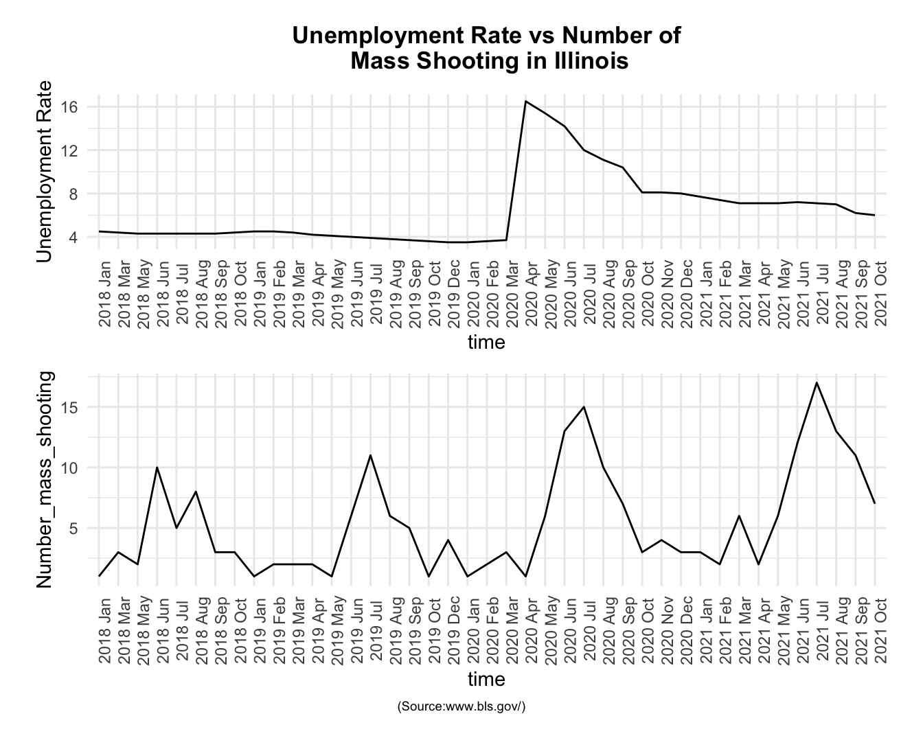
We chose Illinois for a more in-depth analysis. The top is the change in the unemployment rate in Illinois, and the bottom is the change in the number of shootings. First of all, we can find that the number of shootings has obvious periodic changes, and the number of shootings in the summer is obviously high throughout the year. However, it can still be found that the peak after the epidemic has increased significantly, and the number of shootings during the same period has also increased significantly. At the same time, the unemployment rate has always been higher than the value of the unemployment rate under healthy economic conditions.