NY Visualization Analysis
historic_NYPD_df = read_csv("data/NYPD_Shooting_Incident_Data__Historic_.csv") %>%
  separate('OCCUR_DATE', into=c("month","day","year"),sep = "/") %>%
  filter(year>=2018)
year_to_date_df = read_csv("data/NYPD_Shooting_Incident_Data__Year_To_Date_.csv")%>%
  separate('OCCUR_DATE', into=c("month","day","year"),sep = "/")
df = bind_rows(historic_NYPD_df,year_to_date_df) %>%
  janitor::clean_names()
df_time = df %>%
group_by(year,month) %>%
summarise(count=n()) %>%
unite(month,year,month,sep = "/")
df_time%>%
ggplot(aes(x=month, y=count,group=1))+ geom_xspline(color="purple",size=0.7) + geom_point(color="black",size=0.5) + theme_bw() +
theme(axis.text.x = element_text(angle = 90, vjust = 0.5, hjust =1)) +
labs(x = "Month Year", y = "Shooting Incidents", title = "Shooting Incidents in NYC",caption="(Source:opendata.cityofnewyork.us/)") +
geom_segment(aes(x = 27, y = 10, xend = 27, yend = 330) ,colour = "black",linetype="dashed") +
geom_text(aes(x=27, y= 310, label = "first case of death in NYC " ,size=2), colour = "red", vjust = -2.5, hjust = 0.5, size = 3) +
theme( plot.title = element_text(colour = "black", face = "bold",
size = 18, vjust = 2.5, hjust = 0.3), plot.margin = unit(c(0.2, 0.2, 0.2, 0.2), "inches"),axis.text=element_text(colour="black")) +
theme( plot.title = element_text(colour = "black", face = "bold",
size = 20, vjust = 3, hjust = 0.5), plot.margin = unit(c(0.2, 0.2, 0.2, 0.2), "inches"),axis.text=element_text(colour="black",size=8),axis.title=element_text(size=10)) + theme(plot.caption = element_text(size=7)) 
This is a plot showing the number of shooting incidents in NYC from January 2018 to January 2021 in months. we can see a big increase in April 2020 which match the time when COVID-19 outbreak happened in NYC. We assume the COVID-19 outbreak caused the increase of unemployment which leads to a big increase in shooting incidents.
df_boro_before = df %>%
  arrange(year,month,day)%>%
  slice(1206:2205) %>%
  group_by(boro) %>%
  summarise(count=n(),
            ratio=(count/1000)*100,
            time="Before COVID")
df_boro_after = df %>%
  arrange(year,month,day)%>%
  slice(2205:4355) %>%
  group_by(boro) %>%
  summarise(count=n(),
            ratio=(count/2151)*100,
            time="POST-COVID")
df_boro=bind_rows(df_boro_before,df_boro_after)
df_boro%>%
  ggplot(aes(x=fct_reorder(boro,count),y=count,fill=time))+geom_bar(stat = "identity",position = "dodge")+ theme_bw() +
  labs(x = "Boroughs", y = "Shooting Incidents", title = "Shooting Incidents in Five Boros of NYC",caption="(Source:opendata.cityofnewyork.us/)") + scale_fill_brewer(palette="Paired") +
  theme( plot.title = element_text(colour = "black", face = "bold",
size = 20, vjust = 3, hjust = 0.5), plot.margin = unit(c(0.2, 0.2, 0.2, 0.2), "inches"),axis.text=element_text(colour="black",size=8),axis.title=element_text(size=10)) + theme(plot.caption = element_text(size=7)) 
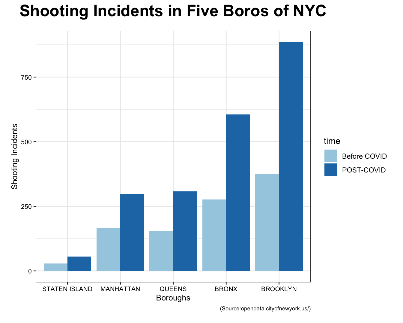
This plot compares the shooting incidents in five boroughs in NYC. we set April 2020 as the outbreak time and before covid means 365 days before April 2020 and post covid means 365 days after April 2020. we can see from the plot that Broolyn has the most shooting incidents and Staten Island has the least. we can the after covid, all boroughs increases in shooting incidents numbers while the order remains the same.
df_boro_time = df %>%
  separate(occur_time,into = c("hour","minute","second"),sep = ":")%>%
  mutate(hour=as.numeric(hour),
    time_period = case_when(
    hour>=0 & hour<6 ~ "MIDNIGHT",
           hour>=6 & hour<12 ~ "MORNING",
           hour>=12 & hour<18 ~ "AFTERNOON",
           hour>=18 & hour<=23 ~ "EVENING"))%>%
  group_by(time_period,boro) %>%
  summarise(count=n(),
            ratio=count/1000)
df_boro_time %>%
  ggplot(aes(x = time_period, y = boro, fill = count))+ geom_tile() +theme_bw() +
  scale_fill_viridis_c(direction = -1)+
  labs(x = "Time Period", y = " Boroughss", title = "Shooting Incidents Cross-compared \n with Time Period and Boros",caption="(opendata.cityofnewyork.us/)") +
    theme( plot.title = element_text(colour = "black", face = "bold",
size = 20, vjust = 3, hjust = 0.5), plot.margin = unit(c(0.2, 0.2, 0.2, 0.2), "inches"),axis.text=element_text(colour="black",size=8),axis.title=element_text(size=10)) + theme(plot.caption = element_text(size=7)) 
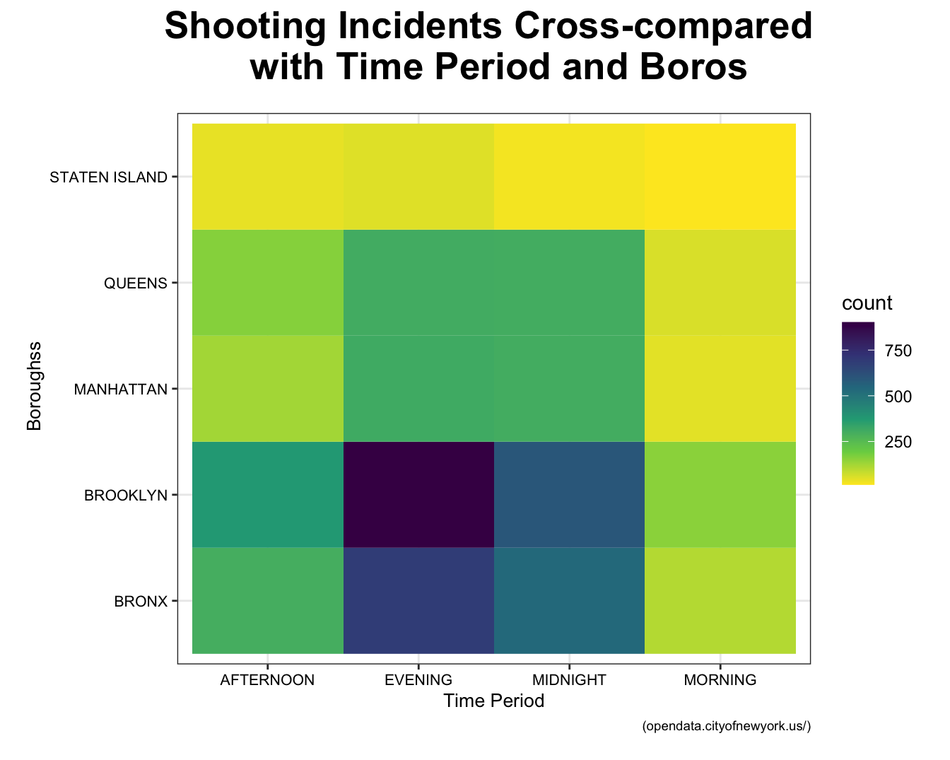
This plot cross-compared time periods and five boroughs in New York City. We divide a day into four parts: 0 - 6 am is midnight, 6 - 12 am is morning, 12 - 18 pm is afternoon and 6 - 12 pm is evening. the darker the block is ,the more shooting incidents happen in this boroughs at this period of a day. As shown in the plot, we can find that Staten Island is the safest borough in which there are very few shooting incidents occurred here. According to a news report, Staten Islanders are roughly three times more likely to own legal handguns than Brooklyn residents, and about four times more likely to own legal handguns than people in Manhattan and the Bronx. This could be one reason for explaining the higher safety of this borough that more people own a gun, more likely criminals need to bear a risk of death, which deter potential criminals and keep the community’s safe. In terms of time, evening and midnight are more dangerous and in term of borough Bronx and Brooklyn have most shooting incidents.
historic_NYPD_df = read_csv("./data/NYPD_Shooting_Incident_Data__Historic_.csv") %>%
  separate('OCCUR_DATE', into=c("month","day","year"),sep = "/") %>%
  filter(year>=2018)
year_to_date_df = read_csv("./data/NYPD_Shooting_Incident_Data__Year_To_Date_.csv")%>%
  separate('OCCUR_DATE', into=c("month","day","year"),sep = "/")
df = bind_rows(historic_NYPD_df,year_to_date_df)

df_period_before = df %>%
  arrange(year,month,day)%>%
  filter(year <= 2019) %>%
  separate(OCCUR_TIME,into = c("hour","minute","second"),sep = ":")%>%
  mutate(hour=as.numeric(hour))%>%
  group_by(hour) %>%
  summarise(count=n(),
            time="2018-2019")

df_period_after = df %>%
  arrange(year,month,day)%>%
  filter(year>= 2020) %>%
  separate(OCCUR_TIME,into = c("hour","minute","second"),sep = ":")%>%
  mutate(hour=as.numeric(hour)) %>%
  group_by(hour) %>%
  summarise(count=n(),
            time="2020-2021")

df_period =
  bind_rows(df_period_before,df_period_after) %>%
  plot_ly(
    x = ~hour, y = ~time, z = ~ count, type = "heatmap", colors = "YlGn"
  ) %>%
  colorbar(title = "Crimes Number", x = 1.1, y = 0.8)

layout(df_period, title = "Crime frequency during a day",
       xaxis = list(title = "Hour", tick0=0, dtick=6),
       yaxis = list(title = ' '),

       annotations =
 list(x = 1.15, y = -0.15, text = "(Source:opendata.cityofnewyork.us)",
      showarrow = F, xref='paper', yref='paper',
      xanchor='right', yanchor='auto', xshift=0, yshift=0,
      font=list(colour = "Cylinders",tag = "A")))
It’s possible that the crime drequency will have changed during the pandemic. We therefore explored whether the crime by time of day changed pre-pandemic versus during the pandemic.
To accomplish this, we created a heat map of gun crime frequency by time of day pre (from 2018 to 2019) and during COVID (from 2020 to 2021). Based on the heat map, it is easier to obtain that gun crime events most happened in the afternoon and evening. Since people are more convenient to commit a crime after dark.
We can also that gun crime events most happened in the afternoon and evening. Since people are more convenient to commit a crime after dark. As seen in this plot, there begin to commit a crime in the afternoon rush hour times of 3-6 PM during COVID as compared to pre-COVID. In addition, there was more gun crimes during COVID.
This map displays the geolocation of gun crime in New York City from 2018 to 2019. The data are interactive and organized by borough.
data_pre =
  df %>%
  janitor::clean_names() %>%
  arrange(year,month,day)%>%
  filter(year <= 2019) %>%
  rename(long = longitude, lat = latitude) %>%
  group_by(boro) %>%
  mutate(crime_number = n(),
         crime_number = as.numeric(crime_number))

pal = colorNumeric(
  palette = "Reds",
  domain =  c(0:1300),
  na.color = "white")

data_pre %>%
  mutate(
    label = str_c("<b>crime number: ", crime_number, "</b><br>location: ", lon_lat , sep = "") ) %>%
  leaflet() %>%
  addTiles() %>%
  addProviderTiles(providers$CartoDB.Positron) %>%
  addCircles(lng = ~long, lat = ~lat, weight = 5, stroke = FALSE, radius = ~sqrt(crime_number)*6, popup = ~ label, color = ~pal(crime_number))%>%
  addMarkers(clusterOptions = markerClusterOptions(), popup = ~ label) %>%
  addLegend("topright", pal = pal, values = ~crime_number,
    title = "2019-2020 Total Gun Crime",
    opacity = 1
  ) %>%
   setView(-73.8399986, 40.746739, zoom = 10.5)
This map displays the geolocation of gun crime in New York City from 2020 to 2021. The data are interactive and organized by borough.
data_during =
  df %>%
  janitor::clean_names() %>%
  arrange(year,month,day)%>%
  filter(year >= 2020) %>%
  rename(long = longitude, lat = latitude) %>%
  group_by(boro) %>%
  mutate(crime_number = n(),
         crime_number = as.numeric(crime_number))

pal = colorNumeric(
  palette = "Reds",
  domain =  c(0:1300),
  na.color = "white")

data_during %>%
  mutate(
    label = str_c("<b>crime number: ", crime_number, "</b><br>location: ", lon_lat , sep = "") ) %>%
  leaflet() %>%
  addTiles() %>%
  addProviderTiles(providers$CartoDB.Positron) %>%
  addCircles(lng = ~long, lat = ~lat, weight = 5, stroke = FALSE, radius = ~sqrt(crime_number)*6, popup = ~ label, color = ~pal(crime_number))%>%
  addMarkers(clusterOptions = markerClusterOptions(), popup = ~ label) %>%
  addLegend("topright", pal = pal, values = ~crime_number,
    title = "2020-2021 Total Gun Crime",
    opacity = 1
  ) %>%
 setView(-73.8399986, 40.746739, zoom = 10.5)
Year to Year Comparison
There appear to some incremental changes in the geolocation of gun crime from 2018 to 2021, including an increase in clustering in the all the region during covid period(2020-2021), relative to pre covid(2018-2019). Further, more gun crime happened during the covid in all neighborhoods of newyork city.
Neighborhood Clustering
There is a rapid increase of gun crime in Bronx and Queens during covid.